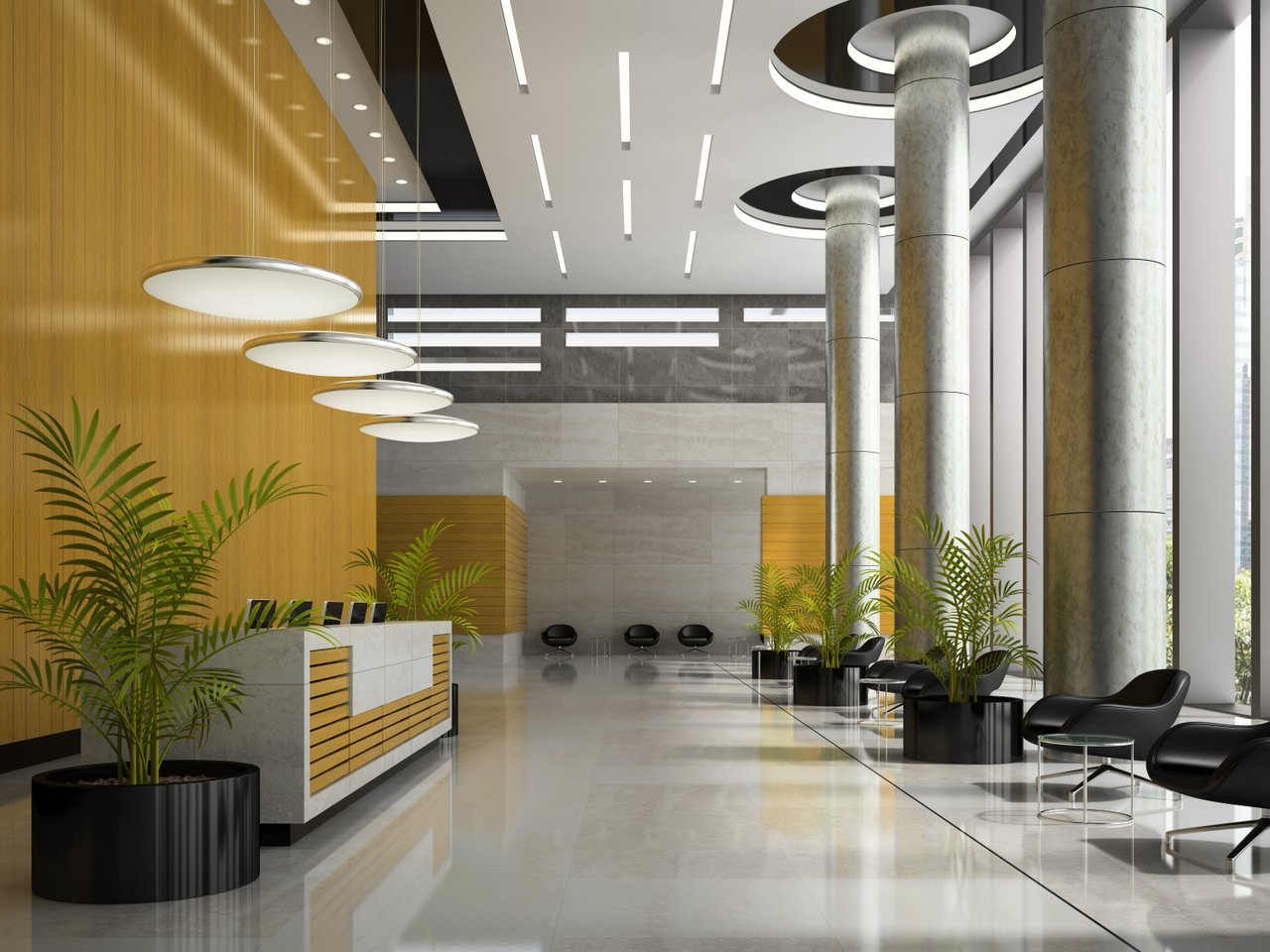
As the saying goes, you only get one chance to make a good first impression. While an impressive website and polite phone presence certainly form part of how people view your company, the first moments of an in-person visit will leave an indelible imprint. Create a modern, comfortable and sophisticated reception area, and visitors will enter a meeting already impressed—so consider the following as you design and refine your reception area.
Comfortable but elegant
We all know what comfortable design looks like and understand why companies should provide a pleasant space for visitors to wait, but doing it successfully can be tricky. A reception area should be comfy and inviting, but still look elegant and sophisticated. The key is to find furniture and decor that straddles the line between the two extremes—you don’t want a visitor to have to perch on a chair that’s more modern art than seating solution, but you also don’t want to plop down a bulky couch or recliner. To find items that work well in a reception area, turn to design companies that focus on providing furniture for the modern office environment, and browse design magazines for inspiration.
You also want to think about those small and considerate touches that make your reception area a more pleasant place to be. Give visitors a stand where they can stow wet umbrellas and hang their coats, and decorate with stylish but practical elements—like runner rugs placed right at the entrance so that guests won’t be greeted with a ‘Wet Floor’ sign. Magazines and even company brochures can also provide a good way to pass the time—just make sure that they are up to date and neatly stacked. WiFi and grouped seats that allow visiting teams to get work done are another must.
No points of confusion

If you’ve ever wondered which line you should join or which receptionist you should approach in a large lobby, you know how confusing—and even intimidating—certain reception areas can be. Make sure that it’s clear where visitors should go to announce their arrival, and provide reception staff with a clear line of sight to the entrance so that they can make eye contact and greet newcomers—a warm greeting starts a visit off on the right note. Lastly, make sure that the reception desk isn’t surrounded by stacks of deliveries or staffed by a single overwhelmed employee. When designing and setting up your space, think carefully about where deliveries will be stacked, and how they will be delivered to employees.
In large reception areas, it’s important to make wayfinding easier by offering signage and other solutions to help new visitors figure out where they need to go. Make sure that the elevators, bathrooms and other common destinations are clearly marked. Ideally, you want to install a modern wayfinding kiosk that not only allows people to navigate around your office, but can even help them locate resources and individual employees.
A sophisticated brand
Think carefully about the message you want your reception area to convey to visitors. Since the reception will often be their first real-world interaction with your brand, it’ll play a significant role in the overall image that’s created. Besides comfort and practicality, the lobby should reflect your brand and its core values. Consider decorating the area with your company’s colors, placing the logo design on the wall or installing televisions playing your company’s advertising near the sitting area.
Skype's reception area has both a reception desk with its logo carved into its front side, and a television screen displaying the company logo. Instead of creating a bland reception area that looks like any other, use the opportunity to show visitors what your brand is all about. Is your company a funky startup or a distinguished investment firm? Whichever, make sure the lobby reflects this.
Clear and easy to navigate

As with the office itself, it’s important to consider the flow of traffic when redesigning the layout of your reception area. A reception is obviously a high-traffic area, so while it’s important to make it comfortable and provide enough seating, you also want to allow for easy movement. Don’t force visitors to bob and weave around furniture, end tables and plant stations—keep clear lines for movement between the entrance, reception desk, elevators and other important destinations. Also, when updating your layout, don’t design with an empty space in mind; make decisions based on the assumption that it will always be busy. A beautiful reception area is pointless if it only functions properly when it’s practically empty.
The redesign of a reception area should be approached with the same rigor and attention to detail as a change to the office itself. Collect data and study usage patterns to understand what the demands of the space are. What’s the maximum number of seats you’re likely to need? How many people travel between the reception desk and the elevators during the busiest hours of the day? How much time do visitors typically spend in the reception area? What are the security and access considerations? Once you’ve collected the relevant data, you can use space management software to make informed space utilization decisions and create a reception area that not only looks great, but functions like clockwork as well.
Looking for commercial space to lease or purchase? Search online here.
Article first appeared: https://www.officespacesoftware.comPhoto Credits: Shutterstock / zhu difeng, Shutterstock / Koksharov Dmitry, Shutterstock / Monkey Business Images

